CASE STUDY — 01
Pantera Family & Sport Club
Mokotów, Warsaw
Full redesign for a Warsaw martial arts and family sport club. A generic WordPress template replaced with a custom hand-coded theme — no page builder — running on ordinary hosting.
pantera.waw.pl ↗— Overview
The Brief
My Role

Before / after — old WordPress hero next to the new looping cut.
The eight decisions this case study explains
Each item below is expanded later in its own section. This list exists at the top so the argument is visible even if you only skim — and so the rest of the page reads as evidence, not surprise.
- 1Video hero over photographyHand-edited 10-second loop of real training — kids first, then Krav Maga, then Tai Chi. Authentic proof of the training environment, not a stock substitute.
- 2Diagonal headline arrangementThe three fragments of the headline are indented progressively — each line shifted further right than the one above it. The text itself forms a diagonal that reads as motion and guides the eye toward the CTA. No graphic overlay needed.
- 3Audience segmentation below the foldThree cards route parents, adults, and companies immediately. The page asks one question and routes — it does not try to be one thing.
- 4Varied section rhythmMarquee reviews, 50/50 USP, 3-col instructors. Rhythm variation signals hierarchy; uniform grids signal "nothing matters most".
- 5No "most popular" pricing badgeStandard SaaS pattern, wrong tool here. Pantera has no online checkout — every CTA leads to a human conversation.
- 6Instructor section keptIn martial arts, students choose the instructor before the club. Real names and faces close the trial booking; this also feeds Google E-E-A-T.
- 7Torn-paper divider rejectedOrganic shapes conflict with the sharp, geometric brand. Background-color shift between sections does the separation job without competing for attention.
- 8Custom theme, no builderA WordPress theme written from scratch — hand-coded templates, no page builder, no plugin bloat — on ordinary hosting. Performance is the visible win; control over every line of markup is the structural one.
— The Challenge
What needed solving
The primary design challenge was audience breadth. A single hero had to speak to a parent looking for safe children's classes, a 30-year-old wanting real self-defense, and a company scoping group training for its team. A secondary challenge was conversion logic: Pantera's sales process runs through a free trial class, not online purchase — every CTA had to funnel toward contact, not checkout.
Chapter
Design
The hardest part of Pantera was not the layout — it was deciding who the homepage was for. Three audiences (parents, adults, companies) share almost nothing in common: different fears, different vocabulary, different reasons for showing up. A single hero either picks one and ignores the rest, or addresses all three and reads as generic.
The page stops pretending it can be one thing. It asks one question — which class are you here for? — and routes. Everything below assumes that choice has been made.
Hero anatomy
The hero uses a 10-second loop of training sessions as the background — a deliberate choice over photography. The cut was edited by hand into three beats in a specific order: kids having fun, adult Krav Maga, then Tai Chi. Kids open the video because the majority of Pantera's classes are for kids — the footage mirrors the actual class mix, not a generic montage.
- 1Google ratingStar rating anchors trust immediately — real reviews visible before any copy is read.
- 2Three-fragment headlineEach fragment targets a different audience concern: methodology, parent trust, local proximity.
- 3Color emphasis on "Bezpiecznie"The single word most likely to stop a parent from bouncing — color emphasis replaces a separate USP block.
- 4One CTA"Pierwszy trening za darmo" removes financial friction. No secondary link, no menu of options.
- 5Diagonal headline arrangementEach headline line is indented further than the one above it. The text itself forms a diagonal across the dark side of the hero, reading as motion and pointing the eye toward the CTA. No overlay graphic — the type is the diagonal.
- 6Curated footage order — kids firstHand-edited 10s loop runs kids → adult Krav Maga → Tai Chi. Kids open the cut because they're the largest audience segment; visitors immediately see themselves (or their child) within the first 3 seconds.
Pantera hero — 10-second loop edited into three beats: kids, adult Krav Maga, Tai Chi.
The diagonal in the hero is not a graphic overlay — it is the headline itself. Each of the three lines is indented further right than the one above, so the type forms a falling slope across the dark zone. A flush-left block of text would feel static. Letting the text become the diagonal pulls the eye down toward the CTA without adding a single decorative element.
Audience segmentation
Immediately below the fold, three cards split the offer by audience group. This is the site's most critical UX decision: instead of making every visitor read through everything, the page asks one question and routes them to their own path.
Three audiences, one homepage
Parents, adult learners, and companies have different fears, motivations, and vocabulary. A single narrative can't address all three without feeling vague.
Segment first, sell second
Three visually distinct cards with real training photos route each visitor immediately. Copy is audience-specific from this point forward.
Reduced cognitive load
Visitors don't have to figure out if Pantera is for them — they see themselves in the card and continue. Bounce probability drops at this section.
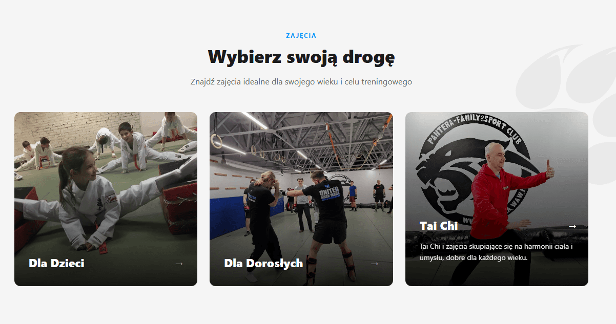
Three audience cards — children, adults, companies.
Rejected layouts
Two alternative directions were explored and discarded before arriving at the final design.
Social proof — reviews
Rather than a static grid of testimonials, reviews are presented as two horizontal marquee rows scrolling in opposite directions.
Counter-scroll rows
Row 1 scrolls left, row 2 scrolls right. The visual tension between them draws attention and creates a sense of depth — reviews feel like they're arriving from multiple sources simultaneously.
Implied scale
A static grid of 6 reviews communicates "here are all our reviews." An infinite marquee communicates "there are too many to count." The latter is the accurate framing for a club with 100+ Google reviews.
Pause on hover
Animation pauses on hover, allowing users who want to read a full review to do so without chasing a moving card. Accessibility baseline for motion-sensitive users.
Counter-scrolling review marquee — pauses on hover.
In martial arts schools, students choose their instructor before they choose the club. Michał, Tomasz, and Janusz are the product. Presenting them as real people with credentials and faces removes the abstraction — a parent is no longer enrolling in "Pantera," they're trusting their child to Michał Jaworski, Krav Maga instructor.
Pricing section
The pricing section presents three tiers but deliberately avoids the "most popular" badge found in the rejected layout.
Chapter
Performance
Lighthouse 95 / 92 / 100 / 100, up from 83 / 86 / 73 / 85. The headline number is useful; the meaningful one is Cumulative Layout Shift — 0.235 to 0.015. CLS is the only Core Web Vital users actually feel: the button that moves under your finger as you tap it, the image that shoves the headline down half a second after it appears.
The fixes were unglamorous — explicit image dimensions, preloaded fonts, the generic theme's CSS gone. Not optimizations in the clever sense; the absence of choices the old theme was making by accident.
Lighthouse before & after
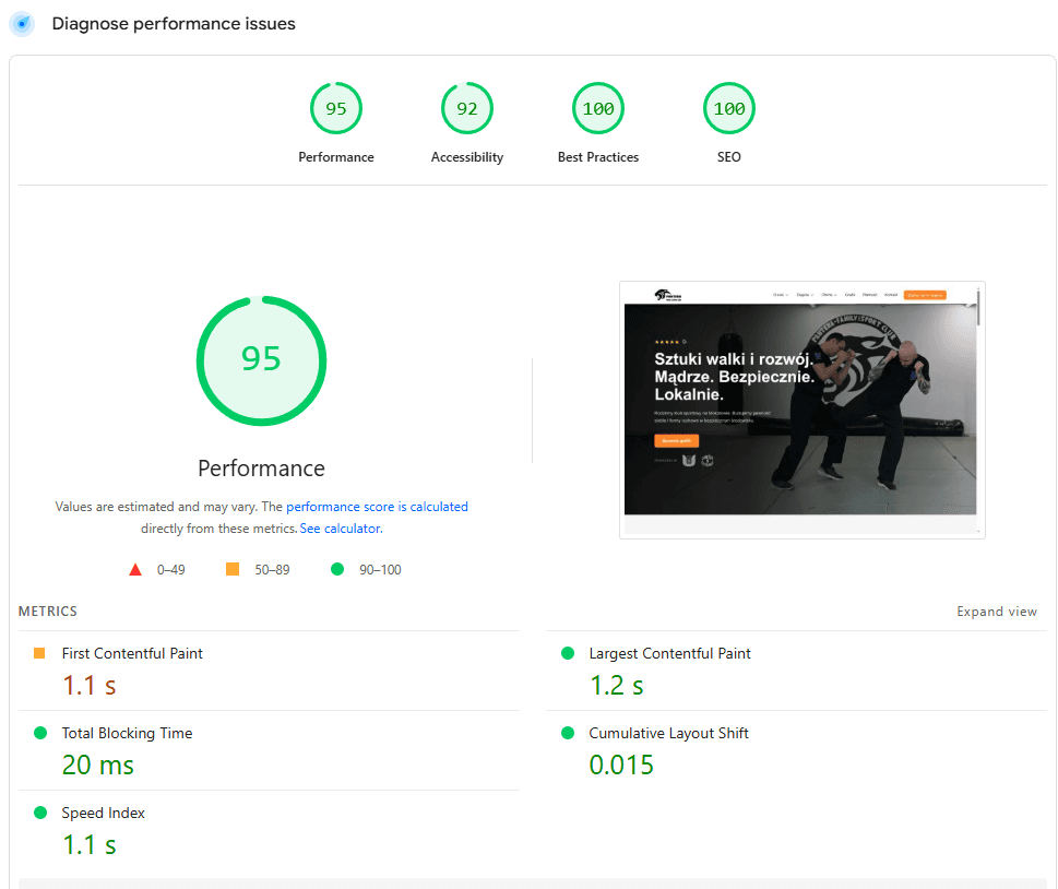
PageSpeed Insights — Performance 95, Accessibility 92, Best Practices 100, SEO 100. LCP 1.2s, CLS 0.015, TBT 20ms.
What actually changed
The most meaningful improvement is Cumulative Layout Shift — the metric users actually feel. The old site scored 0.235, sitting near Google's "poor" threshold of 0.25, which meant visible content jumps as the page loaded. The redesign brings it to 0.015, fully inside the "good" range.
The headline win. Layout shift was caused by images without explicit dimensions and late-loading fonts on the old site. Fixed by setting width/height attributes on every image and using font-display: swap with proper preload.
Old site had mixed content warnings, insecure third-party scripts, and deprecated APIs from old plugins. Perfect 100 reflects clean dependency management and proper HTTPS across all assets.
Correct heading hierarchy, meta descriptions, alt attributes, and structured data — all absent or broken on the old site. The new site ships with proper schema.org markup for LocalBusiness and SportsActivityLocation.
A hand-coded theme ships only the CSS and JS the design actually uses — no builder runtime, no unused framework styles. The redesign also serves a video hero — load times remain comfortably within Google's "good" thresholds despite the heavier above-the-fold asset.
What the old site communicated
The previous pantera.waw.pl used a generic WordPress theme with no brand-specific design system. Several structural decisions actively worked against conversion.
Chapter
Stack
The rebuild stays on WordPress — the problem was never the CMS, it was the theme. The old site ran a generic template that made a hundred small decisions by default: markup bloat, unused CSS, layout shift. The new site is a theme written from scratch — no page builder, hand-written templates, only the styles and scripts the design actually needs.
Staying on ordinary hosting was just as deliberate. A lean theme doesn't need dedicated infrastructure to be fast, the client keeps the admin panel they already know, and any WordPress developer can maintain the site later. No new dashboards, no vendor lock-in, no SaaS fees.
Theme rebuild
The Pantera rebuild replaced a generic WordPress template with a custom theme written from scratch — same CMS, same class of hosting, completely different implementation. This is not a platform migration: it's proof of how far WordPress goes without a builder.
How it fits together
Why this stack
The client already knows it
Content editing stays in the WordPress dashboard the club has used for years — no new admin to learn, no onboarding cost, no dependency on a developer for a schedule change or a price update.
Performance by design
Page builders ship CSS and JS for every feature they support, whether the site uses it or not. A hand-coded theme ships only what the design needs. The Lighthouse gap between old and new site is partly structural, not just optimization.
Editors can't break layout
With a builder, every content edit is also a layout edit — one misplaced drag reflows the page. In a custom theme, layout is locked in code; the client edits content, and only content.
Right-sized infrastructure
A lean theme is fast on the hosting class the club already pays for. No VPS to maintain, no server updates to babysit — the fixed costs stay where a single-location sports club needs them.
Any WordPress developer can take over
The stack is deliberately boring: PHP templates, MySQL, standard WordPress conventions. If the collaboration ends tomorrow, any WordPress developer can pick the site up without archaeology.
Reusable base for sport clubs
The custom-theme approach — hand-coded templates over a stock WordPress install — is now a repeatable base for future sport and martial arts school clients.
A custom theme changes nothing about how the client works — content is still edited in the WordPress dashboard they already know. What changes is what they can't do: there is no builder to accidentally break the layout with. Editing is content-only, by design.
Honest trade-offs
The new stack is the right choice, but it's not free. Documenting both sides keeps the case study honest.
- Only the CSS and JS the design needs — no builder runtime
- Client keeps the familiar WordPress admin
- Layout locked in code — content edits can't break it
- Fast on ordinary, inexpensive hosting
- Any WordPress developer can maintain it later
- SEO 85 → 100, Best Practices 73 → 100
- Higher initial build time than an off-the-shelf theme
- Layout changes require a developer — no builder by design
- WordPress core and plugin updates still need attention
- Custom code means custom responsibility for edge cases